
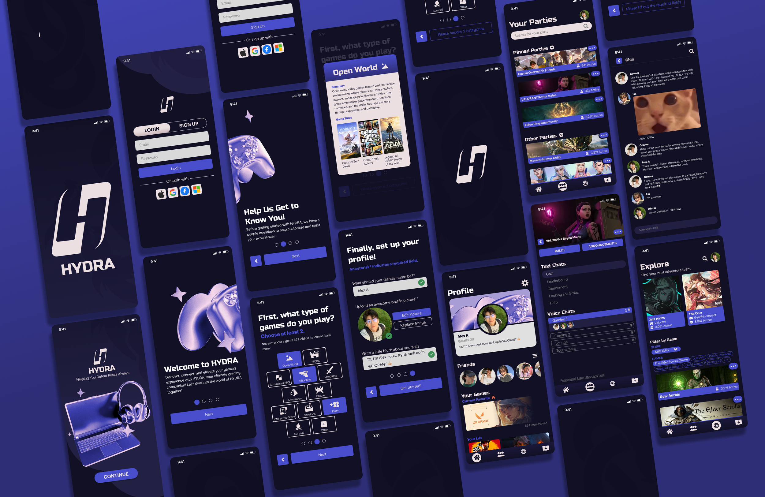
HYDRA: CO-OP
Project Overview
HYDRA helps gamers form compatible teams and access expert guides for a better co-op experience. I led the project's UX design, creating wireframes, prototypes, and streamlined user flows that solved core pain points like unbalanced matchmaking and toxic interactions. My work emphasized intuitive design, thoughtful user research, and a seamless, enjoyable experience for players.
Key Services
User & Market Research
Wireframing & Prototyping
UX Design & User Flow Mapping
Information Architecture
Onboarding & Interaction Design
Visual & Interface Design
Iterative Design & Usability Testing
Problem
In multiplayer gaming, players struggle to easily form compatible teams due to the random team joining or the challenge of finding friends with similar ranks.
Existing games lack native community features, leading players to rely on third-party apps. HYDRA aims to streamline these issues, offering a unified solution for seamless team formation and community discovery in gaming.
What Did Respondents Say?
"Toxic and predatory communities, I also don't like monthly subscriptions"
Anonymous Survey
"Being queer and black in gaming spaces can be a difficult thing sometimes but I believe hydra could make this experience so much easier to help find people just like me"
Anonymous Survey
"Discord is inconsistent. Common audio issues and stuff not working more often than you would think for how highly the app is held."
Anonymous Survey
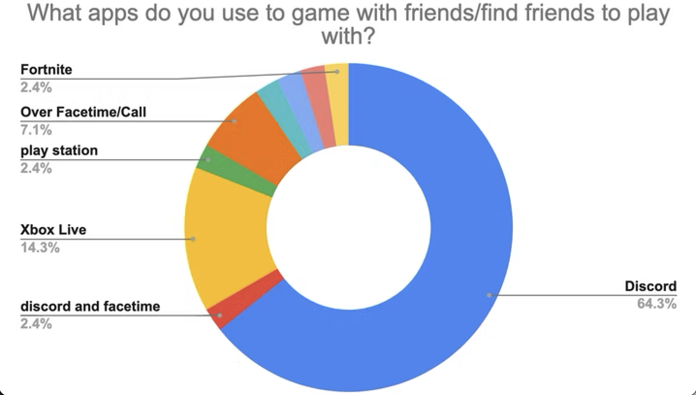
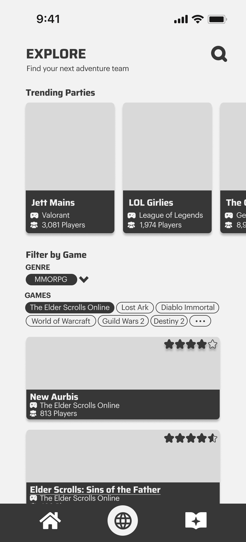
Competitive Analysis
Where are players currently finding communities and gamers?
The main platform that gamers are currently connecting on is Discord, followed by Xbox Live, then Facetime/Call. However the overwhelming majority is through Discord with 64.3% of the respondents stating that they use it.
Greyboxxing
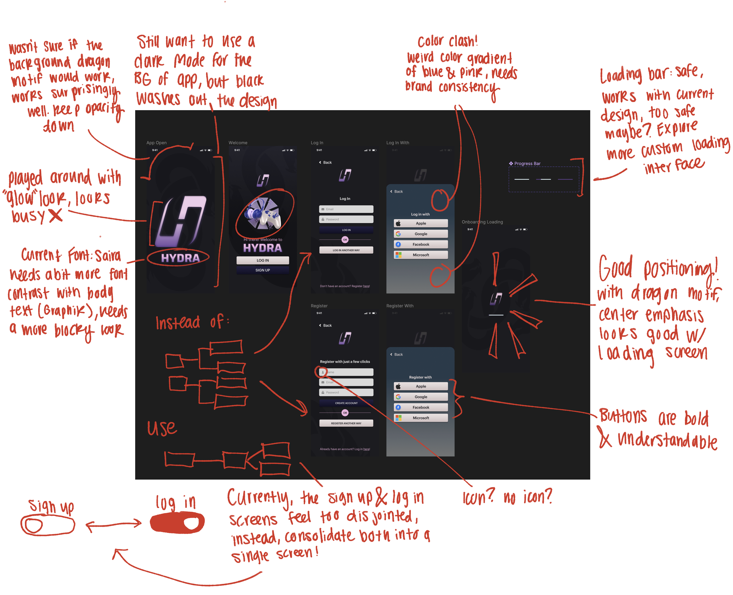
First Design Iteration
When trying to figure out how to design the high fidelity screens, I realized that the first iteration was problematic in many different areas. Mainly in, User Flow, Consistency & Visual Hierarchy.

Sacrifices & Overhaul
To make sure I am making healthy progress to my design, I had to do an in-depth analysis and get my hands dirty in doing a complete rework of the design to find the issues in my current screens.
Main Concerns:
I had too many screens for the user to sign in. From this I realized that I needed to consolidate them into an easy to use experience
The color combination of the design was not harmonious and difficult to look at
By using UX best practices, I also made sure to remove some icons that could be confusing for the user

Iterating the Design
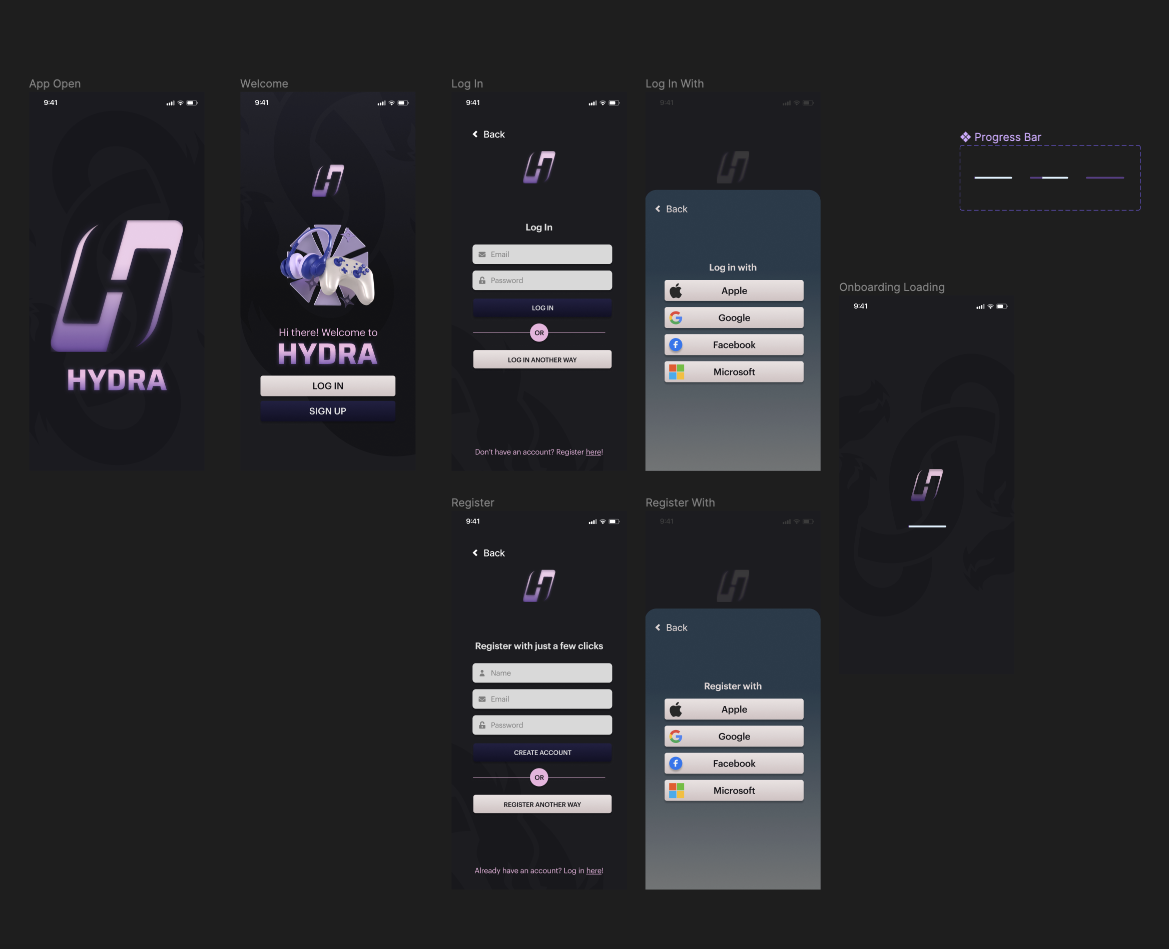
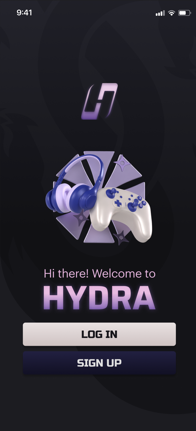
Sign Up/Log In
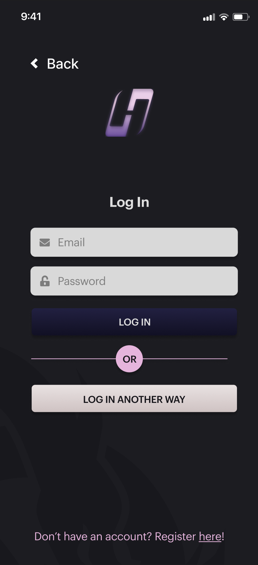
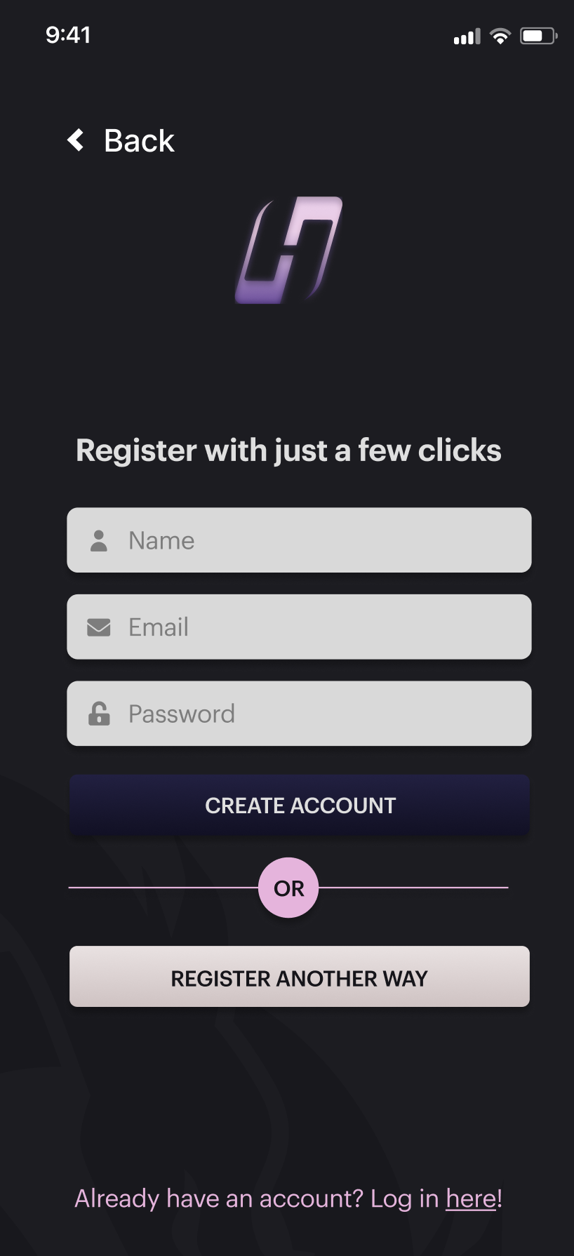
Before
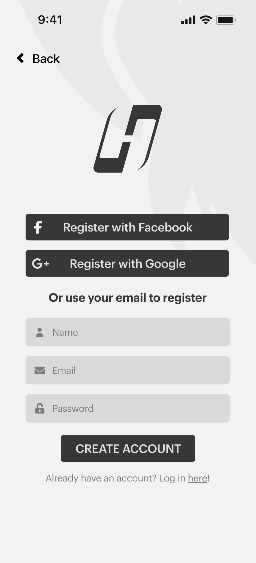
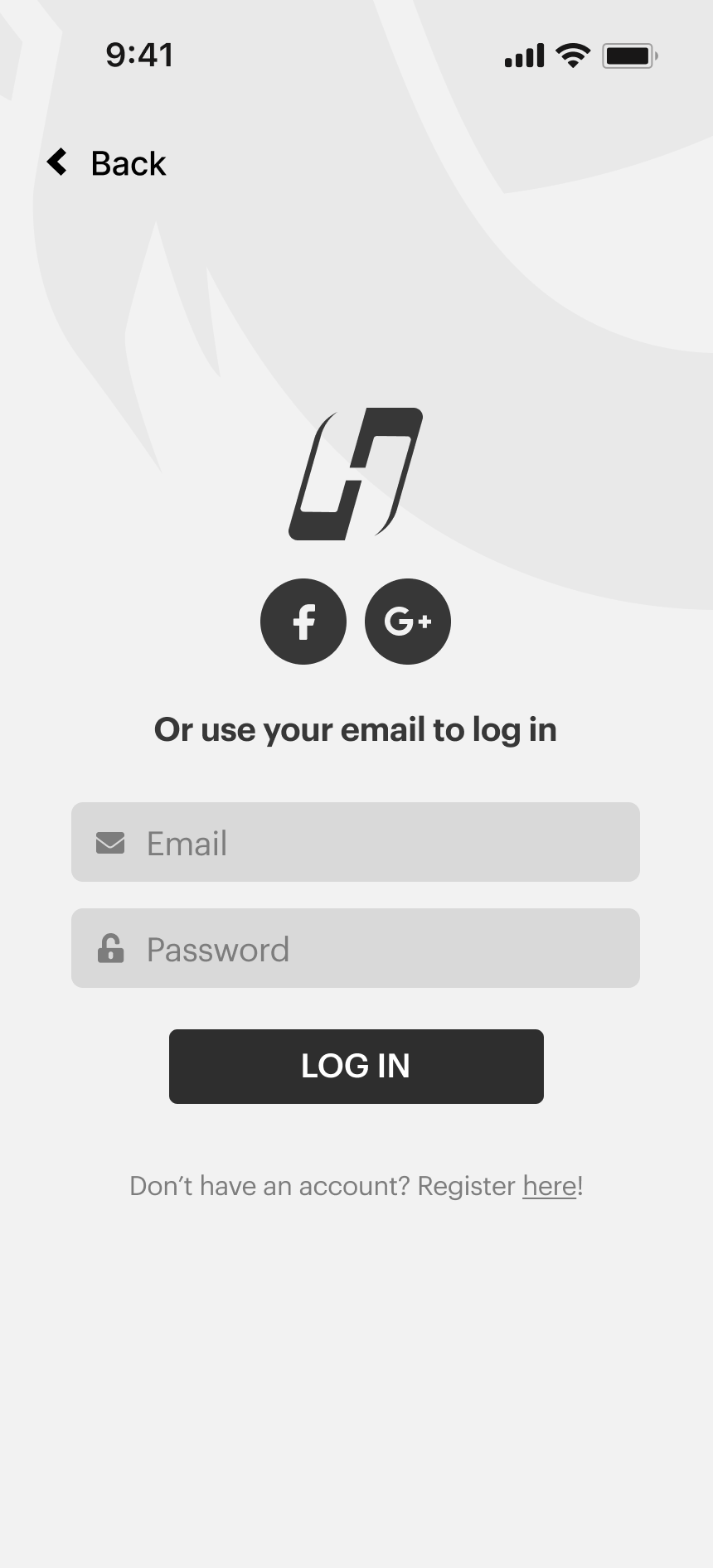
The previous signing in screens had too many buttons to complete a singular action. To fix this I consolidated it to a streamlined flow.
After
Changed Made
Instead of having 2 separate screens for log in/sign up, I created a slider to toggle between logging in & signing up, creating a seamless interaction between the two.
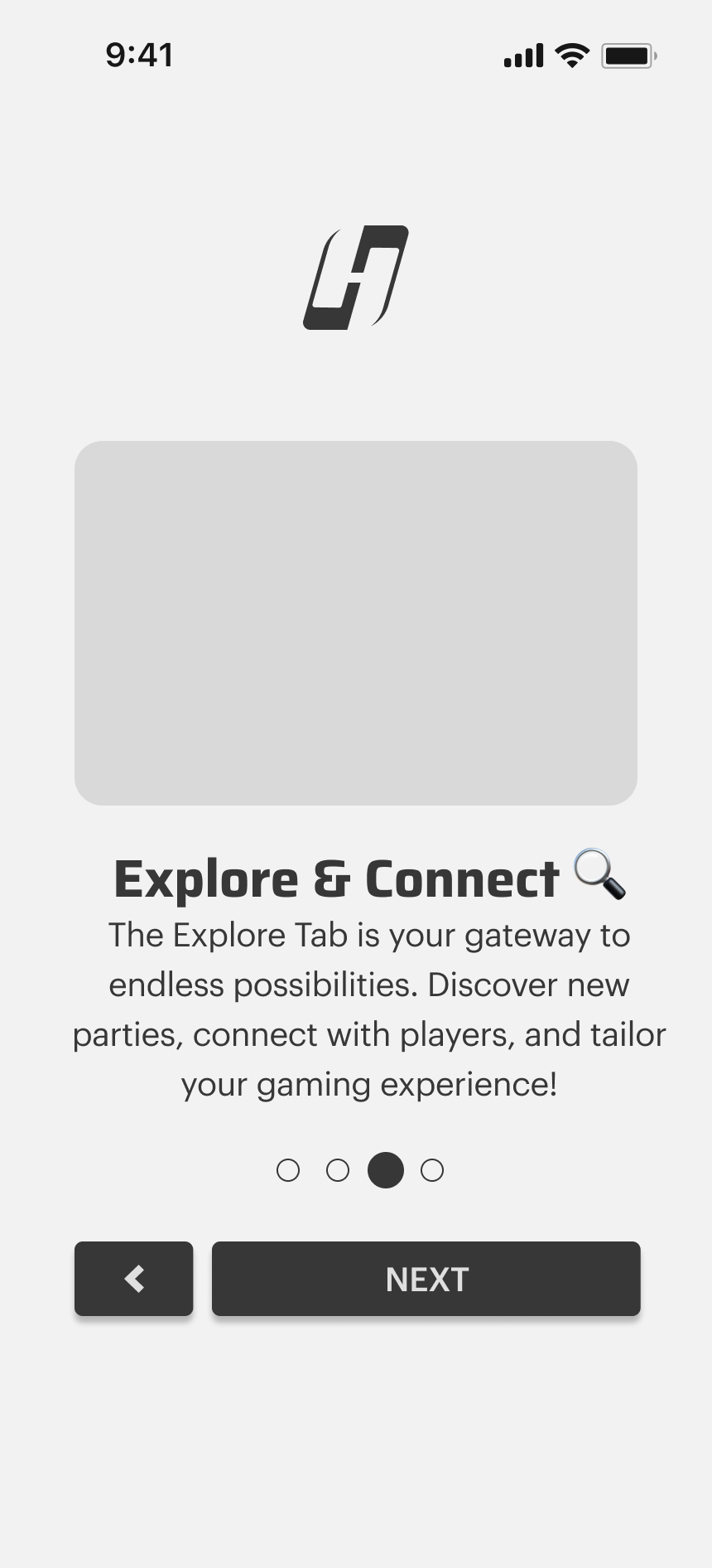
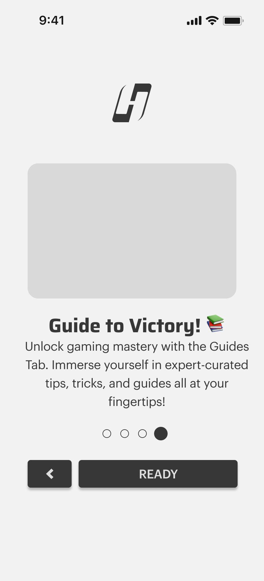
Onboarding

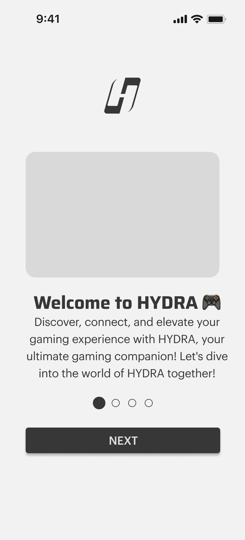
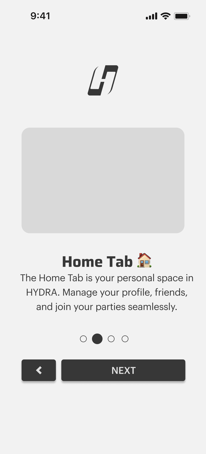
Before
I divided the onboarding into clear steps, each focusing on a specific aspect of the app's functionality and setting up the user's profile. This allowed users to absorb information gradually.
After
Changed Made
Informational support text for game genres added to help users learn about the games they are interested in, helping the algorithm personalize the users experience
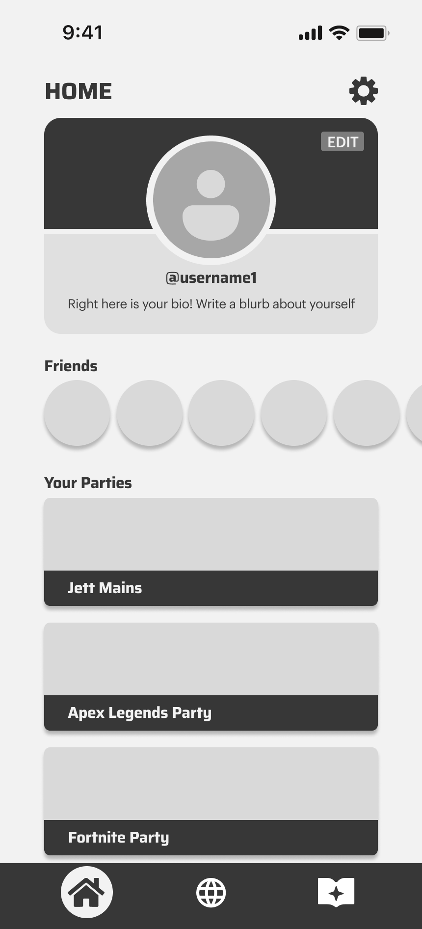
Parties & Voice Chat Function
Before
Parties are the main server function where players can join to find other players. The initial LoFi screens did not have a pages tab, which highlighted to need for one. I also wanted to make sure that the design is fulfilling the user needed for healthy and non-toxic gaming environments.
After
Changed Made
To target the user need of decreased toxicity and focused gaming sessions, a lock feature is added. The lock features allows users to lock their voice chat so their session is undisturbed and notify other members to not disturb their session.